Zaver - Next generation size-agnostic commerce
Brand guidelines

Representing Zaver

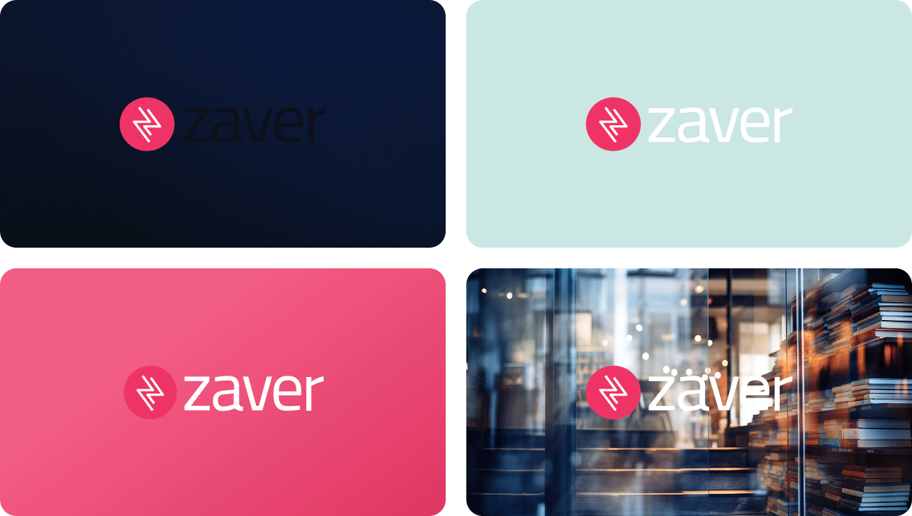
This section focuses on how to correctly use our main brand assets, such as the Zaver logotype, including spacing, placement, and background rules.


Following these guidelines ensures the logotype is always presented clearly and consistently.

Logotype

The Zaver logo is our primary visual asset and must always be used as provided.

It should never be altered, distorted, or combined with other elements. Do not recreate, modify, or reinterpret the logo in any way.

Don’ts

Zaver logo rotated.
Rotate the logo.
Zaver logo with wordmark without the symbol.
Use the wordmark
without the symbol.
Zaver logo colors changed.
Change the colors.
Zaver logo with shadows.
Add effects or shadows
to the logo.
Zaver logo symbol and wordmark reversed.
Reverse the order
Zaver logo with upscaled symbol.
Change the size or position of the symbol.
Zaver logo bolts detached.
Detach the bolts from the symbol.
Zaver logo outlined.
Outline.
Zaver logo disorted.
Disort the logo.
Zaver logo recreated with other typeface.
Recreate using
any other typefaces.

Space

Always maintain sufficient clear space around the logo to ensure visibility and impact.


No text, images, or other elements should enter this area.

Use the symbol height as a minimum reference for spacing.

Zaver logo clear space guide, using the circular icon to define minimum margins around the brand mark.
Zaver logo symbol guide for clear space.
Zaver logo placement example in the middle of a layout.
Zaver logo placement example in the top-left corner of a layout.
Zaver logo placement example in the bottom-right corner of a layout.
Zaver logo placement example in the top-right corner of a layout.
Zaver logo placement example in the bottom-left corner of a layout.
Brand guideline 'Don't' example illustrating an incorrect layout where Zaver logos are placed symmetrically on the left and right sides of the page.

Background

Dos

Use clean, solid backgrounds or controlled imagery where the logo remains clearly visible.
Examples of correct Zaver logo usage: Examples of correct Zaver logo usage: the logo shown on high-contrast solid colors and clear photographic backgrounds for maximum legibility.

Don’ts

Avoid backgrounds with low contrast, heavy textures, or visual noise that reduce legibility.
Examples of incorrect Zaver logo usage: logo placed on backgrounds with insufficient contrast, making it difficult to see.

Co-branding

Zaver may be displayed together with a partner brand when communicating payment options or integrations.


Co-branded layouts must follow defined rules for spacing, alignment, and hierarchy to ensure both brands remain clear and distinct.

Dual logo lockup (Horizontal)

Best suited to wider layouts
Vertical co-branding guide using the Zaver 'Z' height as a measurement for spacing and alignment with a merchant partner logo.

Dual logo lockup (Vertical)

Best suited to narrow layouts
Vertical co-branding guide using the Zaver 'Z' height as a measurement for spacing and alignment with a merchant partner logo.

When to use

Use co-branding when:

Communicating a partnership or integration

Displaying Zaver alongside your brand in marketing materials

When combining Zaver with your brand:

If you are the sender

Your brand should lead. Use your logo as the primary brand, while keeping Zaver clearly visible.
Horizontal co-branding layout featuring the Acme merchant logo placed next to the Zaver logo, separated by a thin horizontal divider line.
Vertical co-branding layout featuring the Acme merchant logo stacked above the Zaver logo, separated by a thin horizontal divider line.

If Zaver is the sender

Zaver leads the communication, with your brand presented as a secondary but clearly visible partner.

Keep clear spacing between logos

Maintain balanced visual weight

Align logos horizontally unless otherwise specified

Ensure both logos remain clearly visible and undistorted

Horizontal co-branding layout featuring the Zaver logo placed next to the Acme merchant logo, separated by a thin horizontal divider line.
Vertical co-branding layout featuring the Acme merchant logo stacked above the Zaver logo, separated by a thin horizontal divider line.

This page is not available in your region.

Work in progress.